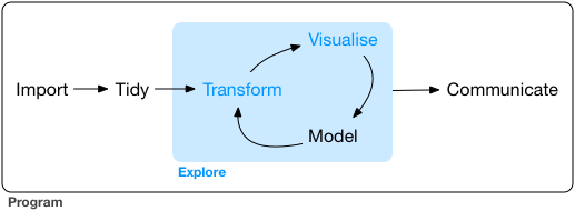
本篇的学习目的是快速掌握数据探索的工具。观察数据、提出假设、快速检验,重复、重复、重复。提出越多假设,探索数据就更为深入。
Data visualisation
R有好几个绘图系统,我们学习用ggplot2进行数据的可视化,因为它最为优雅且全能的。如果想要学它的绘图理论可以看 ”The Layered Grammar of Graphics“。
Question
- 汽车发动机越大越耗油不?
- 发动机的大小和油耗是啥关系?正相关?负相关?线性的?非线性的?
# install.packages("tidyverse")
library(tidyverse)
# -- Attaching packages -------------------------------------------------------------------------- tidyverse 1.2.1 --
# √ ggplot2 2.2.1     √ purrr   0.2.4
# √ tibble  1.3.4     √ dplyr   0.7.4
# √ tidyr   0.7.2     √ stringr 1.2.0
# √ readr   1.1.1     √ forcats 0.2.0
# -- Conflicts ----------------------------------------------------------------------------- tidyverse_conflicts() --
#   x dplyr::filter() masks stats::filter()
# x dplyr::lag()    masks stats::lag()
tidyverse能够帮助我们安装和加载一系列数据处理的包,方便快捷。
ggplot(data = mpg) +
  geom_point(mapping = aes(x = displ, y = hwy))
发动机大小和油耗直接的散点图,可以知道发动机越大,油耗相对越小。
ggplot(data = <DATA>) +
  <GEOM_FUNCTION>(mapping = aes(<MAPPINGS>))
以上是绘图模板。
Aesthetic
- 连续型变量只能aesthetic是连续型的属性
color,size,但shape就不可以(它是非连续型变量); strokeaesthetic 能够改变点的大小(geom_point);aes(colour = displ < 5)则会根据displ判断是否小于5产生F/T逻辑值来分配颜色;
Facets
ggplot(data = mpg) +
  geom_point(mapping = aes(x = displ, y = hwy)) +
  facet_wrap(~ class, nrow = 2)
ggplot(data = mpg) +
  geom_point(mapping = aes(x = displ, y = hwy)) +
  facet_grid(drv ~ cyl)
This is generally a better use of screen space than facet_grid because most displays are roughly rectangular.
facet_grid(class ~ . )class在左边表示按行分面,如果在右边就是按列分面;
Geometric objects
- ggplot2扩展Y叔的ggtree也在里面;
show.legend = FALSE可以把右边图标给去除;
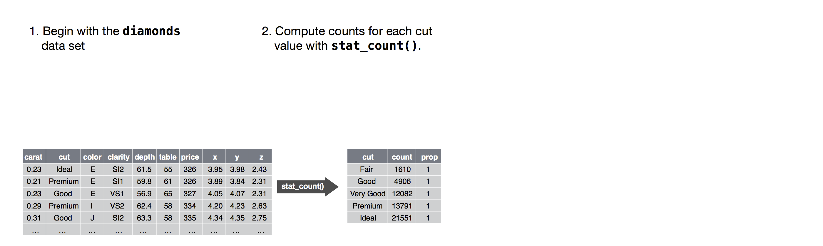
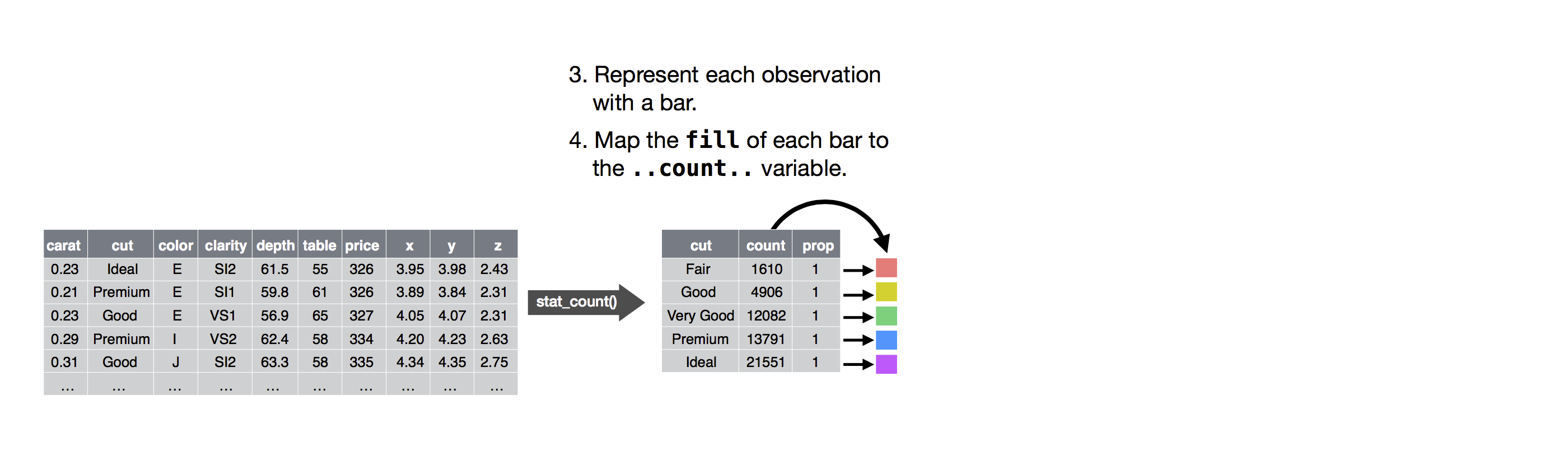
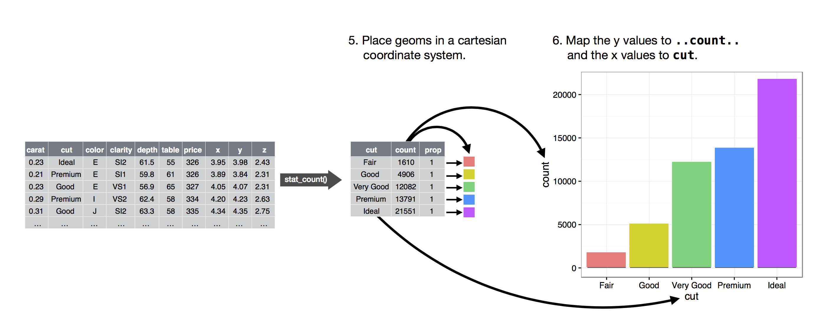
Stat
- In our proportion bar chart, we need to set
group = 1. Why? In other words what is the problem with these two graphs?ggplot(data = diamonds) + geom_bar(mapping = aes(x = cut, y = ..prop.., group = 1)) ggplot(data = diamonds) + geom_bar(mapping = aes(x = cut, y = ..prop..)) ggplot(data = diamonds) + geom_bar(mapping = aes(x = cut, fill = color, y = ..prop..)) geom_col和geom_bar的区别
Position
position = "identity"position = "fill"position = "dodge"geom_point(position = "jitter"):geom_jitter()?position_dodge,?position_fill,?position_identity,?position_jitter, and?position_stack
Coordinate systems
coord_flip()switches the x and y axescoord_quickmap()sets the aspect ratio correctly for mapscoord_polar()uses polar coordinates
Summary
ggplot(data = <DATA>) +
  <GEOM_FUNCTION>(
     mapping = aes(<MAPPINGS>),
     stat = <STAT>,
     position = <POSITION>
  ) +
  <COORDINATE_FUNCTION> +
  <FACET_FUNCTION>
Workflow: basics
Cmd/Ctrl + ↑查找代码记录Alt + Shift + K保存代码
Data transformation
library(nycflights13)
library(tidyverse)
intstands for integers.dblstands for doubles, or real numbers.chrstands for character vectors, or strings.dttmstands for date-times (a date + a time).lglstands for logical, vectors that contain onlyTRUEorFALSE.fctrstands for factors, which R uses to represent categorical variables with fixed possible values.datestands for dates.
dplyr basics
-
Pick observations by their values (
filter()). -
Reorder the rows (
arrange()). -
Pick variables by their names (
select()). -
Create new variables with functions of existing variables (
mutate()). -
Collapse many values down to a single summary (
summarise()). -
group_by()changes the scope of each function from operating on the entire dataset to operating on it group-by-group. -
Every number you see is an approximation. Instead of relying on
==, usenear(). -
Logical operators:
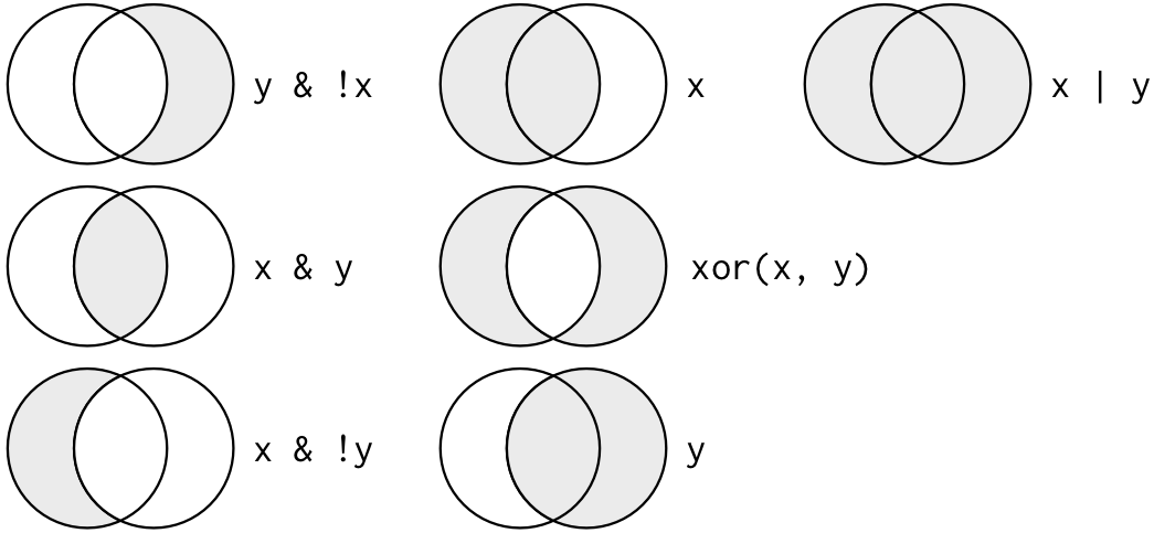
xis the left-hand circle,yis the right-hand circle, and the shaded region show which parts each operator selects
filter(flights, month == 11 | month == 12)
nov_dec <- filter(flights, month %in% c(11, 12))
filter(flights,year %in% c(2013,2014)
filter(flights,between(year,2013,2014)
filter(flights,year == 2013 | year == 2014)
- order:
arrange(),desc() -
select()choose variables:starts_with("abc"),ends_with("xyz"),contains("ijk"),matches("(.)\\1"),num_range("x", 1:3)matchesx1,x2andx3 -
rename(): rename variables -
move
time_hour/air_timeto the start of the data frame:select(flights, time_hour, air_time, everything()) -
comtains()不区分大小写(不知道怎么解决) -
Add new variables with
mutate() -
only keep the new variables, use
transmute() -
log(),log2(),log10():对数是处理跨越多个数量级的数据的非常有用的转换。他们还将乘法关系转换为可加性,这是我们将在建模中回归的一个特征 -
Offsets:
lead()andlag()(暂时没有体会) -
Cumulative and rolling aggregates: R provides functions for running sums, products, mins and maxes:
cumsum(),cumprod(),cummin(),cummax(); and dplyr providescummean();RcppRoll package -
Ranking:
min_rank()(排序的序号?),row_number(),dense_rank(),percent_rank(),cume_dist(),ntile() -
Grouped summaries with
summarise(),group_by() - Combining multiple operations with the pipe:
  by_dest <- group_by(flights, dest)
  delay <- summarise(by_dest,
    count = n(),
    dist = mean(distance, na.rm = TRUE),
    delay = mean(arr_delay, na.rm = TRUE)
  )
  delay <- filter(delay, count > 20, dest != "HNL")
以上等同于,下面的pipe:
delays <- flights %>%
  group_by(dest) %>%
  summarise(
    count = n(),
    dist = mean(distance, na.rm = TRUE),
    delay = mean(arr_delay, na.rm = TRUE)
  ) %>%
  filter(count > 20, dest != "HNL")

  # It looks like delays increase with distance up to ~750 miles
  # and then decrease. Maybe as flights get longer there's more
  # ability to make up delays in the air?
  ggplot(data = delay, mapping = aes(x = dist, y = delay)) +
    geom_point(aes(size = count), alpha = 1/3) +
    geom_smooth(se = FALSE)
  #> `geom_smooth()` using method = 'loess'